Evaluative comments, also known as reviews, are crucial for the sharing economy systems, such as Airbnb, and Couchsurfing. We reveal by studying reviews in different systems of the hosting segment that there is a considerable imbalance towards more positive reviews in the sharing economy systems. We discuss possible implications for this fact, with the help of an experiment performed with volunteers. We also discuss how to explore the results obtained to develop new mechanisms to help users’ decision-making.
Sharing economy is a term that represents person-to-person activities to obtain, provide, or share access to goods and services, coordinated by online services based on a community of users [See The Sharing Economy].
For example, in the hosting segment, Airbnb is a service that connects people who have a space to share with people who are looking for a place to stay, and the host stipulates the value of hosting. Couchsurfing allows people to share their areas similar to Airbnb; however, the hosts do not charge for the service provided. These services usually compete with hotels, being representatives of the traditional economy. Booking.com is one of the most famous platforms in this category.
Users on the sharing economy platforms are typically invited to express their opinions about the service being used, and reviews are among the most critical types. These opinions are crucial to many platforms in this segment. It is not uncommon for businesses like Uber, another example in the transportation segment, to require drivers to have a particular feedback rating to be kept in the system. In the hosting context, negative reviews about hosts can impact rental decision-making.
An essential element of several businesses of the sharing economy, including hosting services, is the personal contact between the guest and the host. This personal contact, intense or less intense, may favor creating a relationship between guest and host. The same situation is not common in hosting services of the traditional economy. We believe this personal contact may put guests in a difficult spot to provide a negative review in services of the sharing economy. Of course, other factors might also play a role in excessively positive reviews. For example, the bidirectional rating systems, i.e., hosts rate guests, and vice-versa, which are common mechanisms in the sharing economy systems and not so common in systems of the traditional economy. Independently of the reason, if this phenomenon tends to happen more on services of the sharing economy, it could undermine an adequate assessment of the service consumed.
With that in mind, we focused on answering a fundamental question: Do reviews in hosting services tend to be less negative in the sharing economy?
To conduct this study, we collected reviews from two sharing economy platforms, Airbnb and Couchsurfing, and a representative of the traditional economy, Booking.com. We consider accommodations offered in three Brazilian cities and three cities in the United States. After getting these data, we performed sentiment analysis on the shared texts. We found that reviews in the sharing economy tend to be more positive than those in the traditional economy. This result is illustrated in the figure below, which shows the distribution of sentiments for all platforms, considering all cities studied separately. Note that this result is consistent for all cities. For more information about all technical details, please refer to the original paper that this post is based on (see it here).
Distribution of sentiment for all platforms, considering all cities studied separately. Negative (-1 to -4), Neutral (0), Positive (+1 to +4).
We also present some key features of these comments and made several supplementary analyses (all presented here), reinforcing the insights observed. For example, we investigate the topics most addressed by users in negative comments. We focus on negative comments because we hypothesize that, in addition to rarer, they tend not to be very informative on hosting platforms of sharing economy. We identified ten topics for negative reviews on Airbnb and Booking. The table below presents ten words that best describe each topic. We note that all topics for Booking tend to be negative. For example, Topic 2 is related to complaints regarding the room, and Topic 4 is more related to the staff. However, when analyzing the topics for Airbnb, we can identify several topics that suggest positive mentions, all marked in bold and with “**” in the table. For example, Topic 4 suggests being related to the accommodation in general, where the topic indicates that users have approved the stay. For reviews in Portuguese, the patterns are very similar. This means that despite the final negative score of some comments (potentially less intense), they have positive mentions in the evaluation.
Ten latent topics from negative comments written in English shared on Booking and Airbnb. Word stem is being presented.
This phenomenon of more positive reviews on the sharing economy systems may limit users’ perception of the quality of a particular accomofation. As negative evaluations tend to be more scarce in reviews in the sharing economy, neutral opinions can become more critical. It is as if the polarity scale began near the neutral, representing the most negative opinions expressed by the users. This suggests that neutral evaluations should be taken into account at the time of choosing accommodation. These evaluations might make a difference in classification and decision making when selecting a place to stay.
To better understand our results’ implications, we performed a study with volunteers to evaluate how the observed phenomenon affects the user decision-making process. After that, we found evidence that the classification of establishments at Airbnb made by users could be affected due to the lack of negative evaluations.
Our findings suggest that reviews on different platforms might require different interpretations, especially for algorithmic-based decision-making approaches that use reviews in the learning phase. In this regard, our study still discusses how to explore the results to choose better accommodations in the sharing economy. We show how the proposition of simple new metrics that consider the reviews’ sentiment could help to minimize problems that can emerge from the uncovered phenomenon.
We hope our quantitative analysis and observations inspire new approaches to account for this perceived bias towards positivity in hosting platforms.
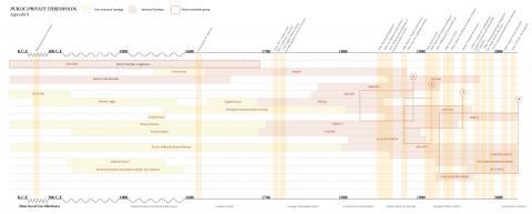
This research project looks deeper into the evolution of threshold spaces in the built environment to help us understand the forces that contribute to their adaptation and reproduction in cities. Fueled by the current resurgence in both cultural value and range of activities afforded by them, these spaces reflect shifts in how the built environment enhances or diminishes levels of human interaction. When thinking of public/private thresholds, the word “porch” might come to mind first. Indeed, where privacy is thought of as the domestic, literature on these liminal spaces is dominated by the typology of the porch. Still, people are describing time spent not only on their porches, but on their verandas, galleries, and balconies. Perry (1985) argues that the porch extends the sphere of control from the house into the public arena, while at the same time bounding the public space. More than the mere boundary between public and private, this project’s goal is to uncover the spatial and social differences in the diverse typologies through their evolution. As a work-in-progress, this post outlines some preliminary findings from the project and opens the door to feedback, advice, or any questions sparked by the content.
In Porches of North America (2012) by Thomas Durant Visser, an important resource for this research, the author defines the porch in “the broad contemporary meaning of an identifiable building feature that is open on at least one side or serves as a covered entry and is large enough to shelter at least one person” (p. vii). However, this broad description has also been used for verandas, galleries and piazzas. There isn’t a clear consensus among existing literature on what the exact differences are, as the terms often bleed into each other. These terms have historically been used interchangeably depending on geographic location or social status, rather than describing a morphological difference. For example, “gallery” was most often used in gulf states and French settled regions of Canada (Visser, 2012; Kahn & Meagher, 1990). Further, some scholars claim that the terms gallery, veranda, and piazza were only used to signal a higher social status to the porch, rather than pointing to a spatial difference (Kahn & Meagher, 1990).
As a starting point in detangling the evolution of these terms and typologies, Appendix A classifies these threshold spaces by distilling them into a short description based on their historical use or origin and schematic plan drawing, largely based on Davida Rochlin’s 1976 thesis on the American porch. This series focuses solely on front-facing thresholds, excluding those that faced inner courtyards (such as loggias) or away from the public street, such as back decks and terraces. Rather than organizing by time, the study separates domestic from other non-domestic typologies, as research shows that these liminal spaces had their origins outside of the home. For instance, the Hourd, a medieval scaffolding device used for battle, is considered a potential precursor to the cantilevered balcony. The domestic typologies can also be further separated into spaces created through addition, such as enclosed porches or cloth awnings. Notably absent in this first series is the word “porch” by itself, due to the difficulty in distilling into one defined drawing or definition as previously described above.
Appendix B is a timeline diagram that studies when the previously noted typologies emerged, when they rose in popularity, and potential lineages between them. It is notable how their prevalence was mostly concentrated between the early 19th century to early 20th century. Where there are American and non-American typologies directly following each other, there is a suggested lineage, such as the French galleries and the American gallery. In addition, it is evident in this diagram how little is known of the potential lineage from indigenous and afro-Caribbean typologies. While most pattern books refer solely to European precedents (Downing, 1852) some southern American scholars claim that the front porch was imported through European settlers of Caribbean islands, due to climatic similarities (Perry, 1985; Donlon, 1996).
Along the top of the diagram are important events that marked a change in use or prominence; here we see the effect of the introduction of pattern books resulting in general diffusion of the form, but also that of war and the introduction of new technologies such as the automobile and air conditioning, resulting in an increase in privacy around the 1940’s (Visser, 2012; Wilson-Doenges, 2001). Enclosed and screened porches increased in popularity; layers added on to make them more of a secluded transition space rather than outdoor living spaces. However, even the “transition” quality of them is questionable. Perry (1985) makes a claim that glassed-in enclosures erase the quasi-public nature of the threshold, rather extending the private sphere of the house. By 1990, car garages were a widespread feature of most new houses being built, taking over a large part of the front facade where porches once were. In this way, the garage became the main access to public space, effectively disrupting the threshold at the porch where these worlds overlap. People retreated to the back deck (or more recently, the internet and social media) for social gatherings, preferring a life separated from the noisy and dirty street.
Appendix B also started classifying popular housing styles that were recognized by their porch as a defining feature. In North America, we tend to associate Victorian houses with large threshold spaces, for example. Here we can see a “call out” of four style groups, expanded on in Appendix C, which starts to match popular styles with typologies or words used in association with that style (whether through drawings or written word). The styles were defined by these typologies, but not vice versa. For example, style group 2 encompasses a wide range of terms, despite its short time period. In Appendix C, we see this group is associated with the Queen Anne style. Considering the sense of security and comfort associated with threshold spaces during this period (Visser, 2012), the variety of typologies employed in Queen Anne homes reinforces a linkage between the accumulation of terms and their affordance of opportunities for social engagement.
Though most of existing literature claims an approximately 100 year time period when porches were most popular, we are seeing a comeback in the past few months due to the COVID-19 pandemic lockdown. The term ”porch sitting” was popular in both that time period and today, as it is now considered one of the safest ways to connect with the public. One of the findings from Appendix B is that an increase in popularity corresponds with the increased use of these spaces as community network building, rather than for climate control. On a larger scale, the affordances fluctuate between more social activities and storage/climate control, as seen at the bottom of the diagram. Appendix D looks deeper into this accumulation of affordances throughout time. Further research is needed to describe the discarding of affordances, as the diagram shows a time when these activities were popular but not whether they persisted. It is interesting to note the evolution of these spaces as mediators between sacred spaces to mediators between public/private spaces – has privacy become sacred?
The two last studies, Appendix E and F, look into house plans found in popular pattern books and kit homes, mostly during the time they were most popular up to the 1970’s when the back deck really took over and words like “concrete slab” started replacing the front porch. Click here and here to look closer at the plan analysis. The typologies are highlighted in these plans and color coded for an approximate comparison of size and location. As a general trend in the mid-19th century, verandas were larger and more rectangular in shape, at least 12’ deep and 14’ long. Porches were also included in the plan, but these tended to be smaller areas right where the door was, making them more square in shape and generally not wider than 8’. These findings are consistent with some descriptions found in literature where the authors attempt to clarify subtle differences in typologies (Visser, 2012). In the early 1900’s, porches became larger, taking the place of verandas. This corresponds to the rise of the “leisure class” (Kahn & Meagher, 1990) and the advent of electrical lighting, allowing verandas, or porches, to become deeper. By the end of WWII, these spaces diminished in size, if included in house plans at all. An important finding from this study is the gradual consolidation around the word “porch”, as represented by pink in the diagram. This is best observed in Appendix F, showing a “figure ground” drawing series of the plans analyzed.
The size of thresholds have a linear relationship with the accumulation of affordances. Smaller porch designs from factors described above resulted in less activities taking place on them, thereby reducing their importance in people’s conception of the home, contributing to its continuing decline. This is consistent with Wilson-Doenges’ (2001) research of factors that increase or decrease front porch use in a post 1970’s neighborhood in the United States. This study found that other than pull factors that lead to lifestyles no longer supporting front porch use, small “cartoon” porches where activities are limited is a push factor that reduces porch use.
It is important to note the limitations and biases in the studies performed for this project, notably in the timeline and plan study (Appendix B and E). For instance, the plan study does not consider regional preferences for the terms, as these plans might have been published in parts of the continent where they speak differently. Further, it is mostly concentrated on those published in the United States, marking a bias away from Canada. Frequency of terms or typologies found in these plans are not reflected, as porches were included less often after 1920. However, rather than it being an exhaustive survey of the frequency of a certain typology or exact timeline of its existence, these studies suggest both a general shift in the size and use of them, and a general resurgence of it with respect to the gaining/loss of a certain affordance. Moreover, it suggests a direction of research we could take with machine learning.
Moving forward in this project, in addition to refining and continuing the studies performed, there are a few questions and possible avenues to explore:
What exactly caused the word “porch” to absorb the wide range of terms and typologies previously used for front facing thresholds?
Further research into balconies as an important threshold typology. What does it mean when the boundary is not physically accessible to the street, while still visually accessible? This is especially important today as it has seen an increase in affordances attributed to these spaces (food basket delivery in Italy, concerts, exercise).
Does the linear relationship between affordances and size still hold true today? Is the dimension of threshold spaces more a matter of “social distancing”?
In the study of the plans, one observation was that the “word” porch was also used over the years to describe the side and back outside features. Why did that stop being used, and why did the “back porch” change to “back deck”? Is it simply a manner of taking off the roof?
Further research into the evolution of a specific typology through a derailed study of how they were represented in plans over the years.
Further research into using Google street map view. A preliminary study was done on this, finding it hard to observe a difference over the years shown other than updating the style of the porch. It seems most of the major changes to front facing thresholds occurred before 2007, when GSM was not yet available in Toronto.
“Push” and “pull” factors (such as Wilson-Doenges 2001 work) from porch use during the Covid-19 pandemic.
Looking in more detail at a specific lineage as suggested in Appendix B. What are the formal linkages between the typologies, and how did that affect the affordances available through time?
Translate main findings from this report into UGP’s formal evolutionary model
A central question in the Urban Genome Project concerns the processes by which features of urban life reproduce themselves over time according to characteristic spatial patterns. One of the surprisingly enduring features of many cities is their characteristic political order: political alliances and oppositions expressed in their geographies.
Our recently published study, “The spatial articulation of urban political cleavages,” examines the bases of this recurrent order, using Toronto, London (UK), and Chicago as case studies. We investigate how a certain activity — mayoral voting — varies depending on the concentration of groups, the built environment, and its spatial location. In the context of our general theory of urban evolution, this can be viewed as an effort to identify the extent to which the recurrent patterns of political activity in these cities derive from variations in their underlying genomes and the emergence of ecological niches in which those activities tend to thrive.
The abstract is below, and a more detailed summary with key figures and results may be found here.
Synthesizing and extending multiple literatures, this article develops a new approach for exploring the spatial articulation of urban political cleavages. We pursue three questions: (1) To what extent does electoral conflict materialize between rather than within neighborhoods? (2) How salient are group, place, and location in defining urban cleavages? (3) How do these sources inflect one another? To answer these questions, the article analyzes a novel longitudinal database of neighborhood-scale mayoral voting in Chicago, Toronto, and London. We find strong evidence of spatially articulated cleavages: in each city, voting patterns are equally or more geographically concentrated than the non-White population, income, and poverty. While group-based interests define Chicago’s cleavage structure, place and location are paramount in Toronto and London. We conclude by proposing a research agenda for investigating the spatiality of urban politics and advancing a preliminary typology of urban political cleavages and the conditions under which they may arise.
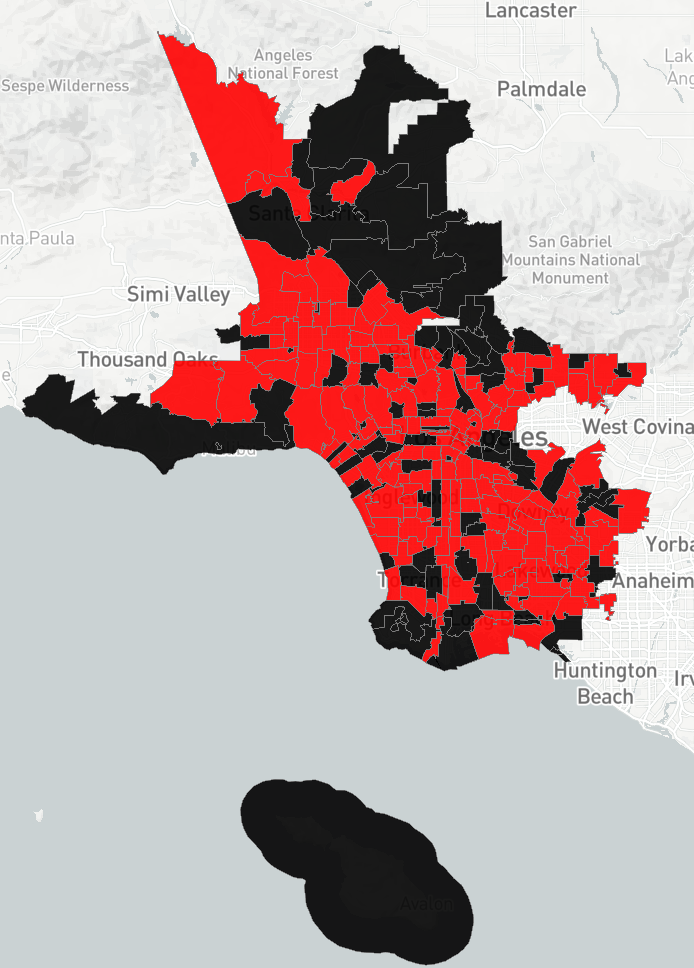
Data for the maps comes from recent Yellow Pages directories, generously shared with us by the “friendly cities lab”. It may not be fully representative of all restaurants but there’s no reason to believe that it is biased.
According to this data:
Nearly half of all zip codes with restaurants have both Chinese and Mexican restaurants, 19% just have Mexican restaurants and 17% just have Chinese.
There is only a loose correlation betweeen the number of Chinese and Mexican restaurants in a zip code(r=.16)
56% of ‘Chinese-Only’ niches are in LA City but only 32% of Mexican Only ones are.
Long Beach, East Los Angeles, and Santa Clarita stand out as cities with more Chinese restaurant deserts; Glendale stands out as a city with more Chinese Restaurant Deserts.
You can explore the trends with the maps pasted below, or at the app here.
http://ug.daniels.utoronto.ca/~diasf/xcity/ – (Temporary link) Cross-city interface for Piccard results, allowing the discovery of similar patterns across the whole US or Canada.
The increasing urbanization and rising need for sustainable development demand effective urban planning, infrastructure development and upgrades. This is a difficult problem due to fiscal limitations and dynamic nature of cities. A novel approach to address this issue is through urban informatics, which uses urban-related data, with aids from mathematical tools and computer science, to better understand urban systems and make economic decisions. Recognizing the importance of urban informatics, an immediate question to ask is how to discover, organize and make openly available urban datasets, which would remain hidden in the nooks and crannies of the Internet. With the research problem in mind, we propose the Global Urban Data Repository (GUDR), a crowd-sourced open repository of urban data build on the standards of the Semantic Web.
The draft contains a numberofvideos that illustrate how the presence of physical venues modify the classic segregation processes described by Thomas Schelling, generating distinctively spatial patterns of order and change.
To understand how the relationship between musicians’ unconventionality and popularity varies across cities, we built in interactive visualization tool. It can be accessed here.
The tool allows a user to compare cities in terms of the musicians that are located there. Across cities, there tends to be an “inverted U” pattern, whereby musicians that are “too conventional” or “too unconventional” are penalized, while bands that exist in the “sweet spot” between the two are relatively popular. However, the shape of this relationship varies depending on the city.
A core idea of urban genetics is that cities are constantly making new versions of themselves. The degree to which the new version resembles the previous one varies. If there is no resemblance, then there is no genetic code to speak of; it is a world without memory or inheritance. If there is absolute fidelity, there is no evolution to speak of; it is a world without variation.
Actual cities exist somewhere on this continuum between volatility and stability, ferment and fidelity. They have a basic genetic code, inscribed in their physical forms and explicit or implicit expectations for how they are to be used, and by whom. These make tomorrow tend to resemble today. However, the script is always being rewritten, sometimes in small ways that accumulate over time into a larger transformation, sometimes in big changes that dramatically threaten to unsettle established routines.
This post explores these themes via the case of Toronto, using two methods: Markov modeling and sequence analysis. These are different ways of investigating temporality, which bring different aspects to the fore in ways discussed below. There are some significant overlaps to the kinds of trajectories Piccard can uncover. However, focusing on a single city for a somewhat shorter time period allows us to use a wider array of more fine-grained variables. Overall, the analysis reveals the urban genetic codes at work in Toronto that recreate its larger patterns of behavior, even as considerable change occurs within and along their borders.
The analysis is in part inspired by the work of Elizabeth Delmelle on “mapping the DNA of urban neighborhoods.” She has a nice summary of her procedure, reproduced here:
Here we follow a similar approach, using Toronto census data harmonized and merged from 1996 to 2011 to 2001 census tract boundaries. With 2016 data becoming available we hope to update the results soon.
This exercise used the following variables: population density; proportion age 25-34; 65+; married; renters; moved in the past year; black; south Asian; Chinese; Arab; Italian; Portuguese; Greek; management occupations; business, finance, and admin occupations; natural and applied science occupations; arts, culture, sports, and recreation occupations; service occupations; blue collar occupations; auto commuting to work; BA or higher degree; non-religious; detached housing, high rises, and median household income.
One could of course experiment with different variables, and any suggestions about others to consider would be welcome.
The next step, following Delmelle, is to standardize all the variables within each year. So there is a standard score for e.g. % renter in 96, 01, 06, 11 – relative to that year.
After that follows a kmeans cluster analysis. In order to be able to discern more subtle variations, we use k = 15 clusters, but compare these to the 3 cluster solution. This allows us to see the bigger more tectonic movements within which the smaller changes are occurring.
The below radar plots summarize the results, in groups of 5
Interpreting latent dimensions revealed by cluster analysis is always tricky. Here are tentative readings, which are open to revision:
Elite suburb
Chinese predominant ethnoburb
Working class Portuguese
Arab predominant
Working class Italian
Middle class creative
Dense lower status immigrant
Young urban professional
South Asian/Black predominant ethnoburb
Bobo
Middle class suburban
Older urban professional
Mixed lower middle class
Greek
Black working class
Now consider radar plots when k = 3.
The labels of the plot show a working interpretation, which corresponds to the three major cleavages we found in the context of studying the Political Order of the City.
Cluster 1: marginality. Larger concentrations of renters, blacks, south Asians; somewhat high concentrations of Arabs, Italians and Portuguese; high unemployment; few managers and artists; more blue collar and service workers; moderate reliance on driving; low income, very low education, highly religious.
Cluster 2: creative city. Highly dense, large concentrations of youth, singles, renters, movers (churn), arts and culture occupations, university graduates, non-religious; fewer blue collar occupations, drivers; somewhat low income.
Cluster 3: establishment-suburbia. Lower density, older, married, homeowners, low churn, low unemployment, more managers, business, sciences, lots of driving, high income and education.
Overall, in line with findings in the “The Political Order of the City,” there are a few main ordering parameters in Toronto. The deepest is urban-suburban. The urban side of this equation basically runs from young/creative class to more middle-class creative professionals. The suburban goes from establishment to marginal, with the marginalized areas including more recent immigrant and visible minority groups. There is some mixing and overlap and alignment, but these are the overall parameters: urban-suburban/establishment-marginal/new-old immigrant.
The next step diverges from Delmelle, but we’ll return to her approach below. Now we generate first order Markov transition probabilities for k =15 clusters. These are based on tracts’ trajectories through these 15 clusters across the 4 years. An example of a sequence would look like this:
This tract remained in the same cluster across the entire period. Combing these sequences for all tracts allows us to determine the probability of transitioning from any of the 15 states to the others at each transition. These are first order Markov processes, so they are only about the probability of a move from a given state to another at any time (i.e. they don’t capture position in a sequence, such as the difference between BAAA and AAAB).
Below is a network graph of the main result. With so many clusters it is difficult to easily visualize; this is a first rough solution. Thicker lines show higher probabilities (except for self-loops), and numbers below .05 are suppressed.
While exploring 2nd/higher order Markov chains to capture position in a sequence would be important to do before developing definitive interpretations, in any case we can make some preliminary observations now. You can readily see for instance which clusters are more stable/well defined in the self-loop probabilities. A lower probability shows a less clearly delineated cluster, or one that is relatively unlikely to re-generate/reproduce itself. Some older European immigrant groups (Greek, Portuguese) are like this (low reproduction), and mostly transition into some “creative city” form. If we think of this process as gentrification, then the most likely targets are older European immigrant neighborhoods. By contrast, newer immigrant groups are mostly transitioning in/out of middle/lower middle class suburban areas, which also show a high degree of volatility.
Some provisional reflections on this diagram:
the most stable part of the city is the “young creative urban professional” areas. We could make a contrast between different forms of stabilibity/creativity/volatility. The most “creative” neighborhoods in terms of population – young, artistic, creative class – are highly highly highly stable, pretty much locked in, without much transition into other neighborhood forms. There is a kind of stability and closed-in character to this form of creativity. By contrast, other parts of the city exhibit much more volatility, shifting back and forth and morphing into one another. So maybe we can say that there is the type of creativity that thrives within a stable type of “creative” urban context. And there is also a way in which the urban form/fabric/shape itself can be in transitional states, which is another maybe deeper and potentially challenging form of creativity from which these other “creative” areas are relatively cut off. Portugali’s reflections below are relevant here.
Related is the idea that the degree of structure itself is something that can vary. Some parts of the city exhibit fairly stable patterns of transition. But others are more volatile. So rather than assume there is an equally powerful genetic code at work everywhere, an important question is about how much of a given urban environment is encoded at all, and to what degree. Above and below we see that much of Toronto is already very very deeply encoded with particular urban genetics, so that they develop in very regular sequences. Whereas there is more volatility elsewhere.
Another issue concerns the notion of “turning points.” This relates to gentrification. Overall, we can see that gentrification is fairly rare. In Toronto, it is mostly happening in Portuguese and Greek areas. Lots if not most of the city’s marginalized communities have little to no transition probability to “creative class” type of areas. However, the fact that it is rare means that when and if it does happen, it is highly significant, and noticed as such. In other words, it is useful to try and isolate big transitions from one state to another, and even it is rare in terms of how often or how extensive it is, it may have an outsized significance in experience.
We can get another view of these relationships by breaking the graphs into sub-graphs, in particular ego-network graphs. This gives us the view from one node. Here we readily see that the big graph is really a composite of a few largely separate sub-graphs. There are parts of the city that are in interaction with one another quite a bit, but which do not interact with other parts very much.
For example, here is the ego-network graph of the “creative professionals.” Note they are largely in interaction with other “creative professional” type groups, elite suburbs, and Greek areas – and nothing else.
And here is “elite suburbs:
And Middle Creative Class:
And here are young urban professionals:
Overall, these graphs indicate that the big graph is really a composite of local processes that don’t communicate much with each other. We might think of these higher-order clusters as ecological niches, constructed in such a way that make it more likely for the more local formations to persist and replicate there. A network representation of the three-cluster solution helps to visualize this:
The three major “ecological niches” of the city each have over a 90% chance of reproducing themselves, with more movement occurring between marginal and establishment (suburban) areas than between either and the “creative city” core.
Altogether, the Markov models illustrate one of the broader points of this post: the major ordering principles of the city reproduce themselves and maintain the differences between them, even as there can remain a relatively large amount of movement to and from different local formations within them. In this way each new version of the city is at once the same and subtly different from its predecessor. This is the backdrop for urban evolution.
That said, there is movement across the city’s major ecological niches, and these interstitial zones may be particularly potent sources for emerging forms of urban life. Switching from the Markov approach to a sequence analytical point of view helps to visualize these spaces, since the sequence approach can be more readily mapped.
Before that, however, let’s pause and reflect for a moment about the different approaches. For further reading, I’d recommend the work of Andrew Abbott, who pioneered optimal matching sequence methods in sociology, and also wrote several very good essays on the more philosophical issues involved in the study of temporality.
These are worth studying in more detail, but the gist for now can be stated in brief: when we look for sequences, we take a narrative view of our subject, and make the narrative/trajectory itself as the object of interest. For instance, say we are studying life course trajectories. Then our object of interest could be two “narratives” that define different life courses:
get good grades in school, get married, get a job, have kids, retire.
Get bad grades, become an alcoholic, bounce around from job to job, multiple divorces, get sick, die young.
From the sequence/trajectory point of view, we are interested in (1) and (2) as wholes (though obviously many more are possible and these are not necessarily normative or normal), and we want to know where/who is more likely to go through one or the other. There are statistical techniques for identifying variables that distinguish them.
For cities, the corresponding approach is to treat a given neighborhood at any moment as “stretched out” in time: it is coming from and going to somewhere; it has what Louis Wirth called a “career.” We can think of this as “context,” but temporal not spatial context. Similarly, we would think of cities as a collection of narratives, so that at any moment various trajectories are unfolding. The trajectory mining approach seeks to map out the main narrative principles that are operating between and within cities.
The Markov type approach is different. The analytical question is about generative processes: what gives rise to these sequences. The sequence itself is a particular outcome of a series of transitions, e.g. from school to marriage to work. If those transitions recur in regular ways, we’ll see a recurrent trajectory, but the more fundamental question from this point of view is the rules that give rise to those patterns. Then we follow along with questions about where the rules come from, and to what/who they are more/less likely to apply.
In a way, this is another version of the classic micro-macro issue, but now in time rather than space. Trajectories are more holistic patterns; Markov processes are bottom-up generative processes. Both are valid and interesting, but the real opportunity for progress theoretically and empirically as always is to somehow join them and understand their interactions.
To that end, let us now consider Toronto from the point of view of its main trajectories. For simplicity, we’ll use the 3 cluster solution. We are working with sequences through the clusters for each tract, which for example look like this:
CTUID01 96 01 06 11
1 5350001.00 2 2 2 2
2 5350002.00 2 2 2 3
3 5350004.00 2 2 2 2
4 5350005.00 1 2 2 2
5 5350007.01 2 2 2 2
6 5350007.02 1 1 2 1
We feed this information into the TraMineR package in R, and from this you can find the most common sequences.
Once again we see overall a very high degree of stability. Most tracts stay the same through each phase.
Then we measure sequence similarity, with optimal matching, and, following Delmelle, cluster the resulting sequences. For the present exercise, we’ll look at 6 clusters of sequences.
For each cluster, there is a large majority of stable areas, and then another cluster of mostly volatile areas, moving back and forth. They don’t (at least at first glance) clearly follow one trajectory, some go one way, others go the other. If we kept following the dendogram down far enough (examining more clusters) maybe things would fall into clearer directional groups, or maybe a different clustering approach would produce that, but so far it doesn’t readily appear. So in sum the overall picture is stability-volatility, with little clear direction of movement from one to the other ecological niche.
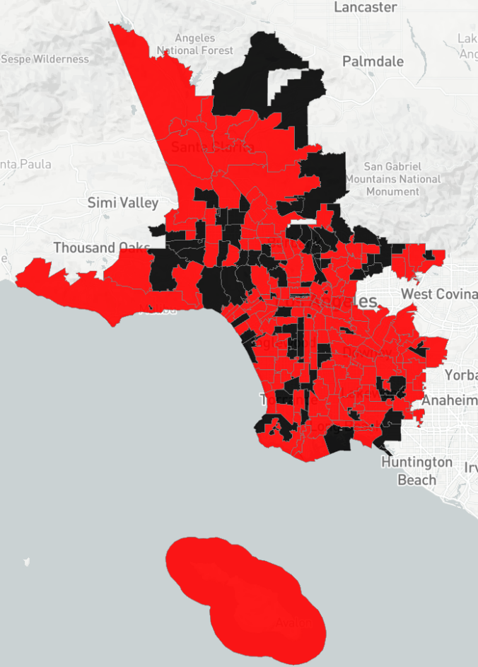
Since these trajectory-clusters are assigned to each tract, we can map them. To be clear, the color shows the trajectory that tract is (more) on. So red areas are areas that remain “creative city” throughout, whereas the purple areas are more volatile establishment-suburban areas.
Overall, there is a very high degree of spatial clustering here. The temporality of these clusters is firmly grounded in space. The genetic code of the city replicates itself through time.
At the same time, amidst these “high fidelity” zones (creative city, marginal areas, establishment suburbs) there and smaller zones of volatility. Eyeballing it, overall the zones of volatility seem to be interstitial, i.e. at the borders between stable zones. There are some exceptions, for example in what looks to be North York Town Centre area, which was classified as “volatile creative city.” It isn’t at the border, but could indicate a more “downtown” creative city form possibly emerging in a more suburban area. There’s also some pink downtown, which indicates some potentially more suburban-leaning parts of downtown. This might point toward the urbanization of suburbia and suburbanification of the urban – that is, new crossings and rewirings, even as the city continues to “remember,” inherit, and replicate its past.
This picture of interstitial zones of transformation gains additional interest if we compare it to some of the results from the work of Juval Portugali (of course the classic Chicago School maps are also of interest). Portugali is very interested in the power of complexity theory to illuminate urban processes, and has developed some intriguing simulation models to capture the imultaneous stability and openness of cities under the banner of “self-organization.”
The whole description is a typical process of self-organization by means of captivity…one can observe, first, a steady state and second, that instability is spatially captured in the boundary belts and spatially confined to the Blue areas…the high-level instability at the initial stages of the game is gradually being imprisoned until a steady state situation is reached. In the latter, instability remains spatially captive in the boundary belts, thus enabling the smooth reproduction of a stable segregative city….The global pattern of the city remains intact, and the system reproduces itself as a stable segregative city by capturing its instabilities, partly concentrated in the boundary belts and partly distributed in dots within the Blue areas.
Thus, in urban scenarios such as in Game 1, changes occur rarely, global processes such as boundary movements are slow, and zones of low-level instability are formed on the boundaries between stable-homogeneous territories. An interesting feature of the above results is that the locally unstable boundary zones exhibit global spatio-temporal stability.
…The areas in between – the boundaries – are thus the most critical areas in the city for socio-spatial changes (and in society at large).
This description of an artificially generated city is remarkably similar to the one we have drawn from real-world data on Toronto
Lastly, as an (even more) speculative enterprise, we can look at the steady state equilibrium the Markov model predicts, and compare that to the initial distribution (in 1996). In other words, if the city continues to generate itself anew as it has over these past years, this is where it is likely to settle (of course it is unlikely to ever settle!). Larger differences are highlighted in yellow to indicate clusters/formations that are predicted to change the most in the future.
To repeat, this is a far to simple model to build a reliable forecast upon. It will be very valuable to explore methods such as higher order Markov chains and Dynamic Bayesian Networks. That said, a simple model is a good place to start. We can use it for example to envision alternative scenarios for how the city might unfold, if it were to change in subtle ways.
To do this, we can simply change the probabilities in our transition matrix, run the model with these imagined generative potentialities, and compare the steady state this produces to the one based upon the probabilities from the actual data. For this experiment, I chose to increase the probability that “arab predominant immigrant,” “Asian ethnoburb,” and “Black Working” class features would appear in “creative professional,” “young urban professional,” “middle creative class,” and “elite suburb” areas.
In reality, the probability of these transitions is essentially 0 — they are in disconnected parts of the larger graph above. In the scenario, I increased the probability to 1% and reduced the probability that the three “receiving” areas reproduce themselves by 3%. In other words, the probability of a change remains very small. This is a strategic decision: it allows us to observe how a very small change might have larger consequences, if it occurs at a key threshold point. In particular, it asks whether even a tiny point of contact among highly disconnected and divided parts of the city can lead to substantial changes. In a complex dynamic interacting system, small qualitative changes at critical points can potentially make a qualitative difference.
Results are here:
The first column shows the same steady state as above, derived from the actual trends in Toronto we have observed. The second one shows what the steady state would be in the scenario we are envisioning — in other words, if we were to alter the city’s genetic code. The last shows the difference, and highlights larger differences in yellow.
There is much to discuss here, but I will highlight a few items of interest. First, note how much the young urban professional share of the population is affected: it declines from 15% to 7% of the population, dropping by over half [or, to put it differently, it would have been expected to increase from 5 to 7% rather than from 5 to 15%]; the Creative Professional area goes from 12 to 7% . A tiny change that barely connects these disconnected and divided areas drastically reduces the isolation of these parts of the city, and helps others to retain their foothold.
Note too that the Mixed Lower Middle class parts of the city increase by a substantial amount, from 10 to 13%. While the transition probabilities for this cluster weren’t changed, its presence in the city grew as result of changes happening in other parts of the city. This again is a mark of a complex system: small changes in one part reverberate in others.


