Category: Research Lines (Page 1 of 2)

GPT-4 as RA? Not yet, it seems.

The below post is by Charlotte Kafka-Gibbons.


Charlotte is a University of Toronto undergraduate, majoring in Biodiversity and Conservation Biology and Environmental Ethics, with a minor in Geographic Information Systems. Charlotte is working closely with Tyler Bateman, a PhD candidate in the Department of Sociology who specializes in Environmental Sociology.

Tyler leads a project studying the various factors that lead to a species becoming classified as invasive, and recently presented results at the Canadian Sociology Association meetings. The research asks two connected questions: 1) What are the cultural meanings of invasive species? and 2) Where do these cultural meanings come from? To answer these questions, the study pursues a computational analysis that uses government texts, biological species records, and additional social data to predict the meanings of individual non-native species— some of which are widely thought of as “invasive”, some of which are not.

The data comes from documents collected in Toronto, Ontario. The findings to date demonstrate a wide diversity in how non-native species gain their meanings. Some species, like the four species dubbed “Asian Carp,” do not have to be physically present to be discussed in policy, labelled invasive and to gain meanings associated with danger and peril. Yet many species, such as dog-strangling vine, do not gain the meaning as invasive for a long period following their establishment. In the paper, we discuss these and other variations in terms of how they relate to social factors. These findings help understand the ways cultural meanings subtly guide political and organizational decision-making.

This project was featured in the School of Cities Research Insights series on the Urban Genome project, available here.

This summer, Charlotte has been assisting Tyler to add new variables to the analytical model. Specifically, they classify each species’ position in the “invasion curve” (defined below) and ask how that classification impacts the species probability of being treated as invasive.

Usually, this sort of classification would be produced manually, and is quite laborious. We wondered if GPT-4 could speed up the process. If it could classify species accurately enough, this would not only tremendously reduce the amount of time and labor necessary to study this and similar phenomena, but it would also permit us to explore other variables that we would otherwise deem to costly or time consuming to incorporate.

Charlotte experimented with various prompts. As her post documents, results were not good enough for us to trust GPT-4 for this research purpose. While we did not explore all possibilities — results might improve for example if we supplied GPT-4 with a more detailed training process — for our present purposes we set it aside and returned to manual coding.

Nevertheless, we would be delighted to receive any recommendations for how to improve and get better results.

**********************************************************************

Reflections on OpenAI’s ChatGPT-4 for Classification of Invasive Species

Charlotte Kafka-Gibbons

Characterization of a particular species as invasive is a powerful rhetorical tool. Consensus that a non-native species is spreading and harming native ecosystems has the potential to catalyze action by conservation and natural management authorities. Nonetheless, definitions of the exact factors that make a species invasive are nebulous and conflicting. 

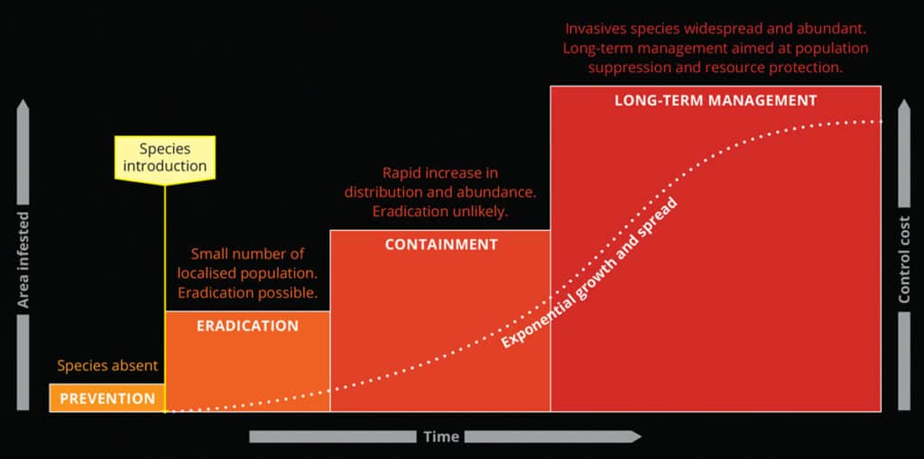
When considering the severity of invasion and most effective management strategies, the invasion curve is an important model. The Canadian Invasive Species Centre defines an invasion curve with four stages, each classifying a specific management strategy and when that strategy should be used based on the extent and impact of invasion (Invasive Species Centre, 2023). The first stage—prevention—represents the actions taken to reduce risk of introduction for known invaders that have not yet been introduced to a region. The second stage—eradication—represents management strategies that focus on complete removal of invaders that are in beginning stages of invasion. Next, the containment stage is reached when likelihood of complete eradication is low but there are sufficient un-invaded areas that can be effectively protected. Finally, the long-term control stage is reached when the species has spread widely throughout the region of focus, and resources are directed towards keeping populations low and reducing negative impacts. 

When exploring the social factors of invasive species perception, knowing where a species falls on the invasion curve in the region of focus, in our case the Greater Toronto Area, can provide valuable context. For this reason, using government documents, we classified 70 species that the Toronto Region Conservation Authority (TRCA) describes as non-native into the four categories of the invasion curve. We experimented with using OpenAI’s ChatGPT-4 tool to aid in this classification but found it to be unsuccessful in its current model, in the end opting for manual classification. ChatGPT-4 is the most recently developed publicly available chatbot by OpenAI, accessible through paid subscription and more powerful than the free version of GPT. Specifically, we used the May 2023 version of GPT-4. We wanted to describe the process we followed in experimenting with GPT-4 as a data collection tool, to contribute to ongoing discussions of the utility of this novel tool.

To begin, we created a prompt with instructions for classification. The prompt specifies detailed definitions for the invasion stages, the set of species to classify, and instructions to run 5 independent duplicate classifications for each species—identifying the consensus result. The prompt also describes formatting for output results, guidelines on justifying classifications, and guidelines on citing sources used. 

Initial Test Prompt:

You are an expert ecologist and sociologist, with expertise about the ecology of the Toronto, Ontario area. You are studying the process by which some organisms become classified as invasive or not. You have a hunch that it has to do with the position of each species on what is known as the “invasion curve.” The invasion curve shows the stages of invasive species management from pre-arrival (prevention) to long-term control. After a species is introduced, management costs increase, and likelihood of eradication decreases as time passes. Prevention: The most cost-effective solution for managing invasive species. Public awareness is essential for this stage. Eradication: Removing a species population in its entirety. If populations are localized, eradication is possible. Containment: Reducing further spread of an introduced species. As populations increase, eradication becomes increasingly unlikely, and priorities shift to preventing further spread. Long-term control: The most costly stage of invasive species management. Eradication is unlikely to impossible, and we instead focus on limiting populations and protecting remaining resources. I would like to give you a set of species. Please generate a table, classifying each one’s position on the invasion curve. The table should include the species’ name, the classification on the invasion curve, a brief explanation of why you classified the species that way, and citations to sources to justify the classification. I would like you to repeat this classification 5 times for each species. Forget the prior classification between each attempt, in other words, each time you reclassify the same species, it should be independent. The table should therefore include 5 rows for each species, showing how you classified each species in each independent run. Then add an additional column, which is an indicator variable to show which of the 5 classifications was the consensus. Whichever received the majority should have a 1, the others a 0. Here are three species to try to classify: Asian Long-Horned Beetle, Garlic Mustard, Purple Loosestrife.

This prompt utilized invasion curve definitions from the Canadian Invasive Species Centre, but revised prompts used definitions from Leslie Anthony’s book The aliens among us: How invasive species are transforming the planet–and ourselves (Anthony, 2017; Invasive Species Centre, 2023). In a test-run of this prompt with three species, GPT provided data in response and produced a disclaimer that the results may be insufficient, prefacing the data table with the statement:

For this exercise, I’ll make some simplifications based on the information available. If this was a real research project, a more detailed and context-specific analysis would be necessary.

(OpenAI, 2023)

GPT also emphasized that the data could only be informed by sources up to 2021. Nonetheless, GPT-4 produced a table with classifications, explanations, sources, and replicates. Below is the output for Garlic Mustard:

SpeciesClassificationExplanationCitationConsensus
Garlic MustardLong-term controlThis species is well-established in Toronto, making long-term control the primary strategy.Ontario’s Invading Species Awareness Program, 20211
Garlic MustardLong-term controlGarlic Mustard has spread throughout Toronto, making eradication or containment unlikely.Ontario’s Invading Species Awareness Program, 20211
Garlic MustardLong-term controlEfforts are largely focused on management and mitigating damage, as the species is deeply entrenched.City of Toronto, 20211
Garlic MustardLong-term controlGarlic Mustard is considered a significant invasive species in Ontario and is managed through long-term control.Ontario’s Invading Species Awareness Program, 20211
Garlic MustardLong-term controlDue to its establishment and spread, Garlic Mustard is now in the stage of long-term control.City of Toronto, 20211

(OpenAI, 2023)

Second, I then scaled up to using the full set of 70 species. I also classified the species manually to check the classifications from GPT-4. After revising the prompt to include all 70 species, GPT rejected the outlined instructions within the prompt, stating:

I’m sorry for the confusion but due to the complexity of the task and the character limit for responses, it’s not possible to generate a comprehensive table for 70 species within this format.

(OpenAI, 2023)

The full set of 70 species could not be generated with GPT-4’s current limitations. I decided to break the prompt into 7 separate prompts, identical besides having different sets of 10 species. GPT was able to produce a table in these 7 runs but rejected prompting to independently analyze each species 5 times and use the consensus of these duplicates. Another significant issue is that some species had no source cited at all. The table below is a selection of GPT-4’s output, showing one species with a broken source link and one with no source documented:

SpeciesClassificationExplanationCitation
Oncorhynchus mykiss (Rainbow Trout)Long-term ControlThe species has established populations, and management efforts are focused on control.3
Alnus glutinosa (Black Alder)ContainmentCan be invasive in North America and efforts are often made to control its spread.

(OpenAI, 2023)

Comparing with the manual classification, 28% of invasion curve classifications matched those done manually. GPT-4 overwhelmingly classified species either in the prevention or long-term control categories, with very few in eradication or containment. The species that were consistent between the GPT-4 and manual classifications were overwhelmingly those in the long-term control category. This could be due to greater documentation and discussion of species with higher range and abundance. Many species that GPT-4 categorized in long-term control were manually classified in eradication or containment, suggesting that the more ambiguous intermediate stages on the curve are more challenging to identify with artificial intelligence. The manual classification involved synthesizing multiple factors for each species: current/past conservation efforts, abundance, range, biotic interactions, and ecological impacts. Consideration of these factors may allow for a more comprehensive categorization. 

In attempts to revise this prompt, the 70 species were broken down into 14 sets of 5. This was the run of the prompt. GPT-4 successfully produced an output with 3 independent classifications for each species. However, only 35% of the cited links were functional, and of those that worked many were for an incorrect species or relied on US conservation authorities, while the prompt specified focus on TRCA jurisdiction. By rewording the prompt and adding greater detail, the number of classifications matching the manual dataset grew from 28% to 46%. However, this match rate is still too low to suggest that GPT-4 can perform with equivalent success to manual classification. 

Overall, it was valuable to investigate what ChatGPT-4 is able to accomplish when it comes to loosely-defined socio-biological factors. GPT-4 does a remarkable job producing coherent and convincing analysis at first glance. However, when checked against official sources, accuracy was not high enough to be used for our purpose. Manual classification seemed the most efficient and effective protocol for this project. Nonetheless, ChatGPT is being constantly updated and its power as a research tool is steadily improving. With further research, continued prompt development, and usage of other tools such as ChatGPT plug-ins, we might be able to see a higher level of success in replicating the manual classification process. 

References

Anthony, L. (2017). The aliens among us: How invasive species are transforming the planet–and ourselves. Yale University Press.

Investing in Prevention: Invasion Curve. (n.d.). Invasive Species Centre. Retrieved August 3, 2023, from https://www.invasivespeciescentre.ca/learn/invasion-curve/

OpenAI. (2023) ChatGPT-4 (May 2023 Version) [Large Language Model].

https://chat.openai.com/chat


“Complex causal structures of neighbourhood change” is published!

One key way that evolutionary processes occur is via feedback loops. A classic way to model such feedback loops is in functional terms. Arthur Stinchcombe articulated the elemental structure of functional explanations in his 1968 book, Constructing Social Theories. In our recently published article, “Complex causal structures of neighbourhood change,” we try to revive this model and demonstrate its value for studying the evolution of cities.

The above figures shows Stinchcombe’s model on the left, and our reformulation of the model for neighbourhood evolution. It codified the causal structure of a complete functional explanation in terms of four core elements:

  1. The consequence that tends to be maintained, which also functions indirectly as a cause of the behaviour or social arrangement to be explained. This is H, the “Homeostatic” variable. Though H may tend to be stable empirically, its stability is maintained against pressures to change it, such as in the case of body temperature.
  2. The social arrangement or behaviour that impacts H, the explanandum. This is S, the “Structure.” In a functional model, Structures tend to maintain Homeostasis. For example, sweat glands tend to maintain body temperature.
  3. Tensions that tend to upset Homeostasis, unless Structures maintain it. This is T, the “tension” variable. If physical activity or air temperature did not alter body temperature, there would likely be no structure to counteract the tensions they create.
  4. Processes that reinforce or select for the S’s (structures) that maintain H (homeostasis). When H is threatened or pressured, these forces increase the activity of S when T (tensions) are higher and decrease when H is maintained. For example, sweat glands generate more sweat (S) when body temperature (H) is not maintained at normal levels due to a certain phenomenon (T). Since this structure helps to maintain H in equilibrium, it will tend to be selected or reinforced.

Stinchcombe’s diagram may be intuitively mapped onto familiar neighbourhood dynamics. For example, we may treat as Homeostatic (H) variables neighbourhood character, style, or scene (such as distinctive shops, restaurants, venues, or groups), Tension (T) variables as pressures to change that character (from, for example, new groups with divergent tastes), and Structure (S) variables as activities that maintain that character (such as Business Improvement Association sponsored festivals, political advocacy, or increased participation in venues and activities distinctive to that scene).

Based on this simple representation, we formulate an initial set of propositions regarding the presence and strength of 1) a functional relationship and 2) a homeostatic response, which can be seen in the paper in more detail.

The key value of such models from the point of considering urban evolution is that treat both persistence and change as a dynamic process. Urban forms of life are retained when there exist structures that preserve them when new challenges. If such structures respond effectively to tensions, there is a tendency for them to be selected and reinforced over time, generating both a pattern of structural retention and possible evolutionary histories of such structures. This idea is scarred further in Part III of “Towards a Model of Urban Evolution,” in our discussion of “retention hypotheses.”


Using data drawn from Yelp.com, we find considerable evidence that the sort of functional process envisaged in the model is a common feature of urban evolution. And in the process we develop novel methods for using data from Yelp and similar sources for such analyses.

We see great potential for using these models and methods for characterizing neighbourhoods in new ways. In contrast to the typical approach, which does so primarily by their demographics or built form, our proposed functionalist approach would identify neighbourhoods with more or less latent potential to resist tensions. In this way, neighbourhoods that look otherwise similar could be shown to have very different probabilities of maintaining their identity over time, thereby allowing planners and policymakers to take these latent functional capacities into account.

While incorporating novel data sources and methods would, to some extent, be challenging, doing so would be in line with parallel proposals. Indeed, local jurisdictions routinely use big data in multiple ways: traffic demand management (using GPS and sensor data), land use (using remotely sensed data), public health (COVID sewage testing), commercial health (using payments data), and more. Our methods could be used in a similar way to monitor tendencies toward neighbourhood change.

From the point of view of social science research more generally, perhaps the biggest result of our study is the possibility of reviving interest in functional explanation. While functional explanation has been characterized as “what any science does,” it has largely fallen out of favour in social science. We review common criticisms, and show that they do not apply to a properly specific functional model of the sort we propose.

At the same time, we find considerable evidence that functionalist motifs are commonplace in neighborhood change research. Researchers typically appeal to functionalist motifs when they discuss for example the capacity of local groups to push back against tensions or challenges as a key mechanism producing continuity or change.  However, we found no examples in the neighbourhood change literature where an author who utilized a functionalist motif articulated the motif in an explanatory model that would render it testable. Instead, much neighbourhood change research remains largely descriptive, mapping types and directions of change across a range of variables.

We hope one result of our study is to illustrate a path for remedying this situation, which in turn would help to more formally incorporate evolutionary thinking into urban research.

Toronto Urban Evolution Model Paper Series Published!

A central theoretical goal of the Urban Genome Project has been to articulate a model of urban evolution. We develop the model in four papers, recently published together in Urban Science. The paper series is called “Towards a Model of Urban Evolution,” because its central task is to elaborate a rich yet rigorous formal language capable of formulating propositions about the evolution of cities.


Paper I is “Context.” It proceeds in four major sections. First, we review prior adumbrations of an evolutionary model in urban theory, noting their potential and their limitations. Examples include Chicago School Ecology, stage theories, and theories of cities as complex adaptive systems. Second, we turn to the general sociocultural evolution literature to draw inspiration for a fresh and more complete application of evolutionary theory to the study of urban life. Third, building upon this background, we outline the main elements of our proposed model, with special attention to elaborating the value of its key conceptual innovation, the “formeme”. A formeme is a specific encoding of urban space as a combination of physical features and the groups and activities toward which they are oriented.

In turn we discuss the value of the model, highlighting its extension of the basic inferential logic of population genetics and evolutionary ecology into the urban domain, including the goal of replacing essentialist with distributional thinking, group and development thinking with tree and network ideas. Last, we conclude with a discussion of what types of research commitments the overall approach does or does not imply. Among other things, we note that an evolutionary model of the sort we develop is neither reductive nor deterministic, nor is it necessarily progressivist or teleological. We conclude by suggesting that an evolutionary approach suggests embracing new metaphors for the role of the planner: the planner less as an engineer pulling the levers of a well-tuned machine and more as a gardener in a forest, seeking to cultivate a rich ecosystem while remaining sensitive to processes unfolding through their own dynamics.

Type of DependenceSummaryExample
Principles Related to Form Features
ScopeFormemes with wider niches will tend to attract more resources. Formemes with wider niche width will have a relativity higher probability of survival when the environment is changing, specialized forms will be favored under stable conditionsMcDonalds has a wider niche width than a vegan, organic hamburger stand.McDonalds is more likely to survive a 30% increase in the local minimum wage or a pandemic than the local hamburger stand.
ContentThe viability of a formeme will be influenced by its proximity to groups with a preference for or against the substantive content of its activities or the group affiliation it affirms.Ethnic shops will tend to proliferate in areas where members of that ethnicity reside; satanic book stores will have low survival rates nearby Evangelical Christian populations.
Distance Propagation of a formeme depends on how physically close it is to other iterations of the same formeme.The franchise of a successful operation will be more viable at some ideal physical distance from the original 
Principles related to environmental features
DensityPropagation of a formeme depends on density of competitors in the environmentNeopolitan pizza thrives when there is a glut of pizza restaurants
FrequencyPropagation of a formeme depends on the size of the formeme’s populationThe 28,000th Starbucks location propagates at a different rate and in different places than the first.
Principles Governing the Evolution of Urban Form

Paper II elaborates the formal model. It defines the Signature of an urban space, comprised of the information encoded in that space. This information consists of: an urban genome, which captures ideas regarding the groups (i.e., users) and activities (i.e., uses) to which a space’s physical forms are oriented; ideas among human actors regarding who (users) and how (uses) to utilize the space and its forms; and the signals that are communicated within and among urban spaces. Central to the model is the notion of the formeme, which provides the building blocks for a Signature. Formemes are units of urban information regarding physical forms, groups, and activities, which may be encoded in physical artifacts, signals, or human actors, and circulate among them. We then show how various metrics can define an urban area based on its Signature, and that these metrics can be used to measure similarity of urban spaces. The Signature, and its underlying formemes capture the sources of variations in urban evolution.

Paper III, “Rules of Evolution,” illustrates how to use the model to formulate propositions about urban evolution. It highlights (1) sources of variations; (2) principles of selection; and (3) mechanisms of retention. More specifically, regarding (1) it defines local and environmental sources of variation and identifies some of their generative processes, such as recombination, migration, mutation, extinction, and transcription errors. Regarding (2), it outlines a series of selection processes as part of an evolutionary ecology of urban forms, including density dependence, scope dependence, distance dependence, content dependence, and frequency dependence. Regarding (3), it characterizes retention as a combination of absorption and restriction of novel variants, defines mechanisms by which these can occur, including longevity, fidelity, and fecundity, and specifies how these processes issue in trajectories define by properties such as stability, pace, convergence, and divergence.

Paper IV, “Evolutionary (Formetic) Distance” provides an application of the model, using data from Yelp.com. It demonstrates how the Toronto Urban Evolution Model (TUEM) can be used to encode city data, illuminate key features, showing how formetic distance can be used to discover how spatial areas change over time, and identify similar spatial areas within and between cities. In this application, each Yelp review can be interpreted as a formeme where the category of the business is a form, the reviewer is a group, and the review is an activity. Yelp data from neighbourhoods in both Toronto and Montreal are encoded in this way. A method for aggregating reviewers into groups with multiple members is introduced. Specifically, we use the Apriori algorithm to aggregate reviewers by the types of venues they visit. Performing group aggregation using a level-wise search, this algorithm abstracts groups based on the forms they conducted reviewing activities for. Building on this basis, longitudinal analysis is performed for all Toronto neighbourhoods. Transversal analysis is performed between neighbourhoods within Toronto and between Toronto and Montreal. Similar neighbourhoods are identified validating formetic distance.

Residential Micro-Segregation via Street Barriers in Lima, Peru

By Fernando Calderon Figueroa

Description of the Study

This study addresses the relationship between residential micro-segregation, in the form of built barriers to urban mobility, and social capital. Most of the scholarship on residential segregation posits the neighbourhood as its most relevant scale of analysis, while discussing built barriers as expressions of pre-existing social boundaries and as the result of higher-status groups’ attempts to seclude themselves from lower ones (Caldeira 2000; Garrido 2019; Massey and Denton 1993). A recent thread of studies has shown the importance of the street level for segregation patterns by bringing attention to the built environment (Grannis 1998; Grigoryeva and Ruef 2015; Logan, Graziul, and Frey 2018; Roberto 2018). Following this line of work, I draw on the notion of spatial micro-segregation to describe the patterns of urban fragmentation that result from resident-driven street enclosures within and across neighbourhoods.

I attempt to empirically test two theoretical propositions:

  • Residential micro-segregation is a socio-spatial process that occurs in the more recently developed residential areas of highly unequal cities that cuts across socioeconomic and ethnoracial boundaries.
    • Empirically, this proposition implies that micro-segregation must be pervasive throughout residential neighbourhoods and particularly concentrated among the most recently developed ones. There should be no correlation between the density of street barriers (e.g., gates, fences) and the socioeconomic or ethnoracial heterogeneity within and across neighbourhoods.
  • Residential micro-segregation negatively impacts the development of social capital and sentiments of community. Barriers to mobility express a form of social closure defined by location that interacts with the existing sociodemographic and ethnoracial composition of the neighbourhood.
    • Empirically, this proposition suggests that measures of social capital (e.g., interpersonal trust) should have decreased in the past few years in areas of the city with higher concentrations of street barriers.

To test these hypotheses, I use the case of Lima, Peru. I draw on the OpenStreetMap project (OSM) to identify the thousands of street-level barriers to mobility built in the city since the late 1990s. OSM is an open access platform, which allows the data to remain public beyond the scope of this study. While a fraction of street barriers has been reported, I am completing the data using georeferenced photographs posted on Mapillary and directly collecting images using an unmanned aerial vehicle (UAV or drone). The sociodemographic and ethnoracial composition comes from the block-level sociodemographic data published by the Peruvian National Institute on Statistics and Informatics (INEI) for the most recent census years (2007 and 2017). To assess social capital changes over time, I use an annual survey (N≈1,200 per year) on community issues conducted since 2010 called Lima Cómo Vamos.

This paper aims to expand our current knowledge about segregation patterns and their implications for social capital in highly unequal cities such as those in Latin America and throughout the Global South. I expect to complete a draft of the article by the end of 2022.

Preview of Spatial Analysis

Here is a preview of the street barrier data collected so far using OSM. The map shows the barriers, by category, in Villa El Salvador, a district in the south of Lima.

References

Caldeira, Teresa P. R. 2000. City of Walls: Crime, Segregation, and Citizenship in São Paulo. University of California Press.

Garrido, Marco. 2019. The Patchwork City: Class, Space, and Politics in Metro Manila. University of Chicago Press.

Grannis, Rick. 1998. “The Importance of Trivial Streets: Residential Streets and Residential Segregation.” American Journal of Sociology 103(6):1530–64.

Grigoryeva, Angelina, and Martin Ruef. 2015. “The Historical Demography of Racial Segregation.” American Sociological Review 80(4):814–42. doi: 10.1177/0003122415589170.

Logan, John R., Chris Graziul, and Nathan Frey. 2018. “Neighborhood Formation in St. Louis, 1930.” Environment and Planning B: Urban Analytics and City Science 45(6):1157–74. doi: 10.1177/2399808318801958.

Massey, Douglas S., and Nancy A. Denton. 1993. American Apartheid: Segregation and the Making of the Underclass. Cambridge: Harvard University Press.

Roberto, Elizabeth. 2018. “The Spatial Proximity and Connectivity Method for Measuring and Analyzing Residential Segregation.” Sociological Methodology 48(1):182–224. doi: 10.1177/0081175018796871.

New paper published! The Dilemmas of Spatializing Social Issues

Illustration by Fernando A. Calderón-Figueroa

Urban Genome Project Members Fernando A. Calderón-Figueroa, Daniel Silver, and Olimpia Bidian’s paper discussing Toronto’s Priority Area Program (2006–2013) has just been published in Socius: Sociological Research for a Dynamic World. Here’s Fernando’s summary:

Among the multiple ways to subdivide a city, neighbourhoods are probably the most familiar to our everyday experience. It is not surprising that neighbourhoods have been at the centre of revitalization efforts for almost a century. Yet, the early 2000s marked a transition towards systematic efforts to define neighbourhoods and their boundaries and identify the most disadvantaged among them. We call this process the spatialization of social issues, which was largely facilitated by the proliferation of Geographic Information Systems (GIS) technology in both academic and policy circles. More importantly, planning decisions that emerged from this trend affected neighbourhoods’ trajectories over time beyond policymakers’ original intentions.

Our paper explores the unwanted consequences of spatializing social issues in three steps. First, we examine whether designating entire neighbourhoods for social policy may affect their desirability as expressed in changes in rent and housing prices and in new building permits. Second, we assess the extent to which designated neighbourhoods may leave out areas “in need” that fall outside their boundaries while including better-off families within them. Third, we analyze evidence on whether this spatially-targeted policies may expand the stigma associated with certain places—e.g., a “dangerous” intersection or a “poor” housing complex—to all the designated neighbourhoods and the people within them. We draw on difference-in-difference models and income distribution analysis for first two parts, and on a qualitative assessment of newspaper articles and policy documents for the third one.

We make a twofold intervention in the existing literature on place-based policies. First, we bring together two social policy debates that share the common goal of attempting to improve the quality of life of those in areas of concentrated disadvantage. The “targeted” versus “universal” debate, heir to the 1970s welfare state scholarship, addresses the effectiveness and drawbacks of each of these approaches. The second is the “individual” versus “place” debate, in which researchers assess whether urban revitalization efforts should focus on individuals or entire places (e.g., “enterprise zones”). We bring together these traditions by treating each approach—targeted, universal, individual, and place—as dimensions in a two-by-two table. This intervention allows us to identify the potential negative externalities of neighbourhoods as policy targets (the targeted-place approach) while uncovering the potential of less-explored possibilities beyond spatial designations (the universal-place approach). Our second intervention is to bring to the fore a sociological conception of the neighbourhood that highlights its singularities as a scale of policy intervention. We suggest that neighbourhoods are interwoven in the urban landscape—thus, treating them as isolated entities poses significant challenges—and that their reputations matter for people’s self-conceptions and decision-making processes.

The study examines these ideas through the case of the Toronto Strong Neighbourhoods Strategy as it was implemented between 2006 and 2011. The program established 13 “priority areas for investment” and aimed to channel federal, provincial, and municipal resources into underserved communities to improve their social infrastructure. This was a response to the increasing poverty and crime rates in Toronto’s inner-suburban neighbourhoods. Previous research has found mixed evidence of the program’s effectiveness. However, we focus on assessing its unintended consequences, particularly regarding the lasting impact of the “priority neighbourhood” label as a shorthand for the target areas even after the program was relaunched in 2011. We find that, compared to otherwise similar and nearby places, those that received the “priority” designated had substantially lower growth in home prices, building permits, and rents.

(a)

(b)

(c)

Figure 2. Graphs (a) and (b) show trajectories comparing undesignated (red) and designated (light blue) DA paths on average monthly rent (left), average dwelling value (centre), and the cumulative sum of building permits (right) before (a) and after (b) matching. In graph (a), the markedly different trajectories respond to comparing the priority areas with the rest of the city. Graph (b) shows narrower trajectories albeit the growing gap between undesignated and designated areas across the three outcomes remains. Finally, graph (c) splits the priority areas between neighbourhoods designated by the CSP (green) and those included by the SNTF (light blue). The plots in graph (c) show that the gap between undesignated and designated DA paths grows wider over time for the CSP priority areas. Each outcome (column) has a different scale. 

The paper does not aim to entirely dismiss place-based policies but to expand how we think about them. Current location-based technology allows better ways to identify neighbourhoods and people’s needs for social infrastructure based on mobility and consumption patterns, street connectivity, among other measures, rather than relying on imposed official boundaries. Targeted policies may be combined with more universal approaches that reduce spatial inequalities while using resources efficiently. Our goal is to bring back sociological view of neighbourhoods as complex and interdependent foci of social life rather than isolated policy targets.

Listen to lead author Fernando A. Calderón-Figueroa discuss this paper by streaming the video below.

New paper published! Venues and segregation: A revised Schelling model

line
Generative models of urban form

simulations

It goes without saying that most of our lives are spent in buildings. Less obvious are the implications of this obvious fact.

Consider a two-dimensional map. It presents a smooth surface, but the reality it represents is warped. Certain points on it support more interaction than others: the ones with buildings on them. Being near such a point puts you in close contact with more people than elsewhere. Depending on the social rules governing who is supposed to be there and what they are supposed to do, the building may increase or decrease your chances of coming into contact with people similar to or different from yourself.

They are not just physical structures, they are venues for social life, and the social order of cities grow up around them. If they change — their number and distribution, their rules of social inclusion or exclusion, the types of activity they afford — the city changes as well. This combination of forms, groups, and activities is the anchor of our model of urban evolution

In a new paper (with Ultan Byrne and Patrick Adler), we show via computer simulations the power of venues to affect the broader urban order by shaping the interactions of individuals. We do so by building upon the classic work of Thomas Schelling/ In 1971, Schelling proposed what became known as the “Schelling model of segregation,” which expressed in an especially clear way the type of thinking for which he eventually received the Nobel prize: local, small-scale interactions generate larger aggregate structures, often in surprising ways.

The “Schelling model of segregation” shows this vividly. Imagine a checkerboard with red and blue pieces that represent individuals. Let’s say each individual has a desire to be around people of their own group. Let’s make it relatively small: a red individual wants at least 25-30% of the others around them to be red, otherwise the’ll move to a different location where this condition is met, if they can.

Schelling showed that, starting from a random distribution of reds and blues, if you repeat this process over and over again you’ll end up with basically total segregation of red and blue. The map that results looks eerily like real cities.

The irony is that, within the Schelling model, no individual agent wants this outcome. The social structure is not necessarily a direct result of individual intentions. Moreover, once that pattern of segregation sets in, outside of a radical transformation of human psychology, little can be done to alter it (within this model).

This is a model and like any model it makes many simplifying assumptions. In our paper, we think through the implications of something maybe so simple that prior studies of this model have largely overlooked: there are no buildings in it, it does not capture the warped space we live in.

So we built a model that extends Schelling’s to include buildings in the simplest way we could think of. Basically, you need four things: 1. a travel radius (how far your reds and blues will go to visit the venue); 2. exclusivity (is the venue exclusive to one group, like an exclusive golf club, or is it open to members of any group); 3. obligatoriness (are individuals obliged to attend it, like an orthodox synagogue, or is it more optional, like a cafe); 4. physical features (how many venues are there, and where are they located).

With those simple features, you can account for, and observe the logical implications for urban segregation and integration, of one of the most pervasive facts of our experience, which is that we congregate in buildings. This happens because the people you interact with in buildings alter the Schelling-style calculation as to whether an individual feels “comfortable” in their location. One might be a majority in terms of the people who live nearby or who you pass by on the street, but a minority when you include those you meet in the venues. Or vice versa: you might be a minority in terms of who lives there, but interact with many people of your group in the local venues (who traveled there from elsewhere) or travel elsewhere to interact with members of your group.

By repeating and varying those simple processes you can think through their implications. One is that they generate a distinctively urban order: Schelling’s model yields clumps whose physical location has no meaning or basis. With buildings in the model, you can generate an East vs. West side (“opposite sides of the tracks”) or a centre-periphery structure with a more diverse core and more homogenous peripheries.

You can also observe how, depending on the characteristics and location of the building, it is possible to forestall the deep segregation characteristic of the Schelling model from arising, without requiring any radical transformation of individuals’ psychology. You can also unsettle deeply sedimented patterns of segregation through the right combination of venue parameters, whereas they are basically set in stone in Schelling’s highly individualistic model (via a genetic algorithm, not shown in this paper but coming to a blog post soon)

And you can find ironies and reversals like the sort Schelling exposed. Just as Schelling demonstrated that one cannot simply read individual intentions from collective patterns of behavior, one cannot simply read organizational values from their surrounding patterns of segregation. Relatively exclusive venues can generate diverse neighborhoods (by providing a local foothold for minority groups to sustain their distinctive cultures), while relatively inclusive venues can in some circumstances produce highly segregated areas (by drawing in tolerant and “adventurous” persons who, despite their individual understanding, change the overall makeup of the area).

An advantage of the computer simulation approach is that you can pinpoint the precise mechanisms by which these outcomes occur. Some of these include “evacuation,” “cooptation,” “bootstrapping,” “cascading,” and “bridging.” 

The paper also includes videos showing the simulation runs unfold. 

The abstract is below. The paper is freely available here.

Abstract: This paper examines an important but underappreciated mechanism affecting urban segregation and integration: urban venues. The venue- an area where urbanites interact- is an essential aspect of city life that tends to influence residential location. We study the venue/segregation relationship by overlaying venues onto Schelling’s classic (1971) agent-based segregation model. We show that a simulation world with venues makes segregation less likely among relatively tolerant agents and more likely among the intolerant. We also show that multiple venues can create spatial structures beyond their catchment areas and that the initial location of venues shapes later residential patterns. Finally, we demonstrate that the social rules governing venue participation alter their impacts on segregation. In the course of our study, we compile techniques for advancing Schelling-style studies of urban environments and catalogue a set of mechanisms that operate in this environment.

Public/Private Thresholds

line

Population formetics and the circulation of urban forms

This research project looks deeper into the evolution of threshold spaces in the built environment to help us understand the forces that contribute to their adaptation and reproduction in cities. Fueled by the current resurgence in both cultural value and range of activities afforded by them, these spaces reflect shifts in how the built environment enhances or diminishes levels of human interaction. When thinking of public/private thresholds, the word “porch” might come to mind first. Indeed, where privacy is thought of as the domestic, literature on these liminal spaces is dominated by the typology of the porch. Still, people are describing time spent not only on their porches, but on their verandas, galleries, and balconies. Perry (1985) argues that the porch extends the sphere of control from the house into the public arena, while at the same time bounding the public space. More than the mere boundary between public and private, this project’s goal is to uncover the spatial and social differences in the diverse typologies through their evolution. As a work-in-progress, this post outlines some preliminary findings from the project and opens the door to feedback, advice, or any questions sparked by the content.

In Porches of North America (2012) by Thomas Durant Visser, an important resource for this research, the author defines the porch in “the broad contemporary meaning of an identifiable building feature that is open on at least one side or serves as a covered entry and is large enough to shelter at least one person” (p. vii). However, this broad description has also been used for verandas, galleries and piazzas. There isn’t a clear consensus among existing literature on what the exact differences are, as the terms often bleed into each other. These terms have historically been used interchangeably depending on geographic location or social status, rather than describing a morphological difference. For example, “gallery” was most often used in gulf states and French settled regions of Canada (Visser, 2012; Kahn & Meagher, 1990). Further, some scholars claim that the terms gallery, veranda, and piazza were only used to signal a higher social status to the porch, rather than pointing to a spatial difference (Kahn & Meagher, 1990).

Domestic and Non-Domestic Threshold Typologies
Domestic Additions and Special Use Typologies

As a starting point in detangling the evolution of these terms and typologies, Appendix A classifies these threshold spaces by distilling them into a short description based on their historical use or origin and schematic plan drawing, largely based on Davida Rochlin’s 1976 thesis on the American porch. This series focuses solely on front-facing thresholds, excluding those that faced inner courtyards (such as loggias) or away from the public street, such as back decks and terraces. Rather than organizing by time, the study separates domestic from other non-domestic typologies, as research shows that these liminal spaces had their origins outside of the home. For instance, the Hourd, a medieval scaffolding device used for battle, is considered a potential precursor to the cantilevered balcony. The domestic typologies can also be further separated into spaces created through addition, such as enclosed porches or cloth awnings. Notably absent in this first series is the word “porch” by itself, due to the difficulty in distilling into one defined drawing or definition as previously described above.

Appendix B is a timeline diagram that studies when the previously noted typologies emerged, when they rose in popularity, and potential lineages between them. It is notable how their prevalence was mostly concentrated between the early 19th century to early 20th century. Where there are American and non-American typologies directly following each other, there is a suggested lineage, such as the French galleries and the American gallery. In addition, it is evident in this diagram how little is known of the potential lineage from indigenous and afro-Caribbean typologies. While most pattern books refer solely to European precedents (Downing, 1852) some southern American scholars claim that the front porch was imported through European settlers of Caribbean islands, due to climatic similarities (Perry, 1985; Donlon, 1996).

Typology and Styles Timeline

Along the top of the diagram are important events that marked a change in use or prominence; here we see the effect of the introduction of pattern books resulting in general diffusion of the form, but also that of war and the introduction of new technologies such as the automobile and air conditioning, resulting in an increase in privacy around the 1940’s (Visser, 2012; Wilson-Doenges, 2001). Enclosed and screened porches increased in popularity; layers added on to make them more of a secluded transition space rather than outdoor living spaces. However, even the “transition” quality of them is questionable. Perry (1985) makes a claim that glassed-in enclosures erase the quasi-public nature of the threshold, rather extending the private sphere of the house. By 1990, car garages were a widespread feature of most new houses being built, taking over a large part of the front facade where porches once were. In this way, the garage became the main access to public space, effectively disrupting the threshold at the porch where these worlds overlap. People retreated to the back deck (or more recently, the internet and social media) for social gatherings, preferring a life separated from the noisy and dirty street.

Appendix B also started classifying popular housing styles that were recognized by their porch as a defining feature. In North America, we tend to associate Victorian houses with large threshold spaces, for example. Here we can see a “call out” of four style groups, expanded on in Appendix C, which starts to match popular styles with typologies or words used in association with that style (whether through drawings or written word). The styles were defined by these typologies, but not vice versa. For example, style group 2 encompasses a wide range of terms, despite its short time period. In Appendix C, we see this group is associated with the Queen Anne style. Considering the sense of security and comfort associated with threshold spaces during this period (Visser, 2012),  the variety of typologies employed in Queen Anne homes reinforces a linkage between the accumulation of terms and their affordance of opportunities for social engagement.

Mapping connections between popular housing styles and typologies

Though most of existing literature claims an approximately 100 year time period when porches were most popular, we are seeing a comeback in the past few months due to the COVID-19 pandemic lockdown. The term ”porch sitting” was popular in both that time period and today, as it is now considered one of the safest ways to connect with the public. One of the findings from Appendix B is that an increase in popularity corresponds with the increased use of these spaces as community network building, rather than for climate control. On a larger scale, the affordances fluctuate between more social activities and storage/climate control, as seen at the bottom of the diagram. Appendix D looks deeper into this accumulation of affordances throughout time. Further research is needed to describe the discarding of affordances, as the diagram shows a time when these activities were popular but not whether they persisted. It is interesting to note the evolution of these spaces as mediators between sacred spaces to mediators between public/private spaces – has privacy become sacred?

Accumulation of Affordances over Time

The two last studies, Appendix E and F, look into house plans found in popular pattern books and kit homes, mostly during the time they were most popular up to the 1970’s when the back deck really took over and words like “concrete slab” started replacing the front porch. Click here and here to look closer at the plan analysis. The typologies are highlighted in these plans and color coded for an approximate comparison of size and location. As a general trend in the mid-19th century, verandas were larger and more rectangular in shape, at least 12’ deep and 14’ long. Porches were also included in the plan, but these tended to be smaller areas right where the door was, making them more square in shape and generally not wider than 8’. These findings are consistent with some descriptions found in literature where the authors attempt to clarify subtle differences in typologies (Visser, 2012). In the early 1900’s, porches became larger, taking the place of verandas. This corresponds to the rise of the “leisure class” (Kahn & Meagher, 1990) and the advent of electrical lighting, allowing verandas, or porches, to become deeper. By the end of WWII, these spaces diminished in size, if included in house plans at all. An important finding from this study is the gradual consolidation around the word “porch”, as represented by pink in the diagram. This is best observed in Appendix F, showing a “figure ground” drawing series of the plans analyzed.

The size of thresholds have a linear relationship with the accumulation of affordances. Smaller porch designs from factors described above resulted in less activities taking place on them, thereby reducing their importance in people’s conception of the home, contributing to its continuing decline. This is consistent with Wilson-Doenges’ (2001) research of factors that increase or decrease front porch use in a post 1970’s neighborhood in the United States. This study found that other than pull factors that lead to lifestyles no longer supporting front porch use, small “cartoon” porches where activities are limited is a push factor that reduces porch use.

Popular Plans from Pattern Books and Kit Homes Analysis

It is important to note the limitations and biases in the studies performed for this project, notably in the timeline and plan study (Appendix B and E). For instance, the plan study does not consider regional preferences for the terms, as these plans might have been published in parts of the continent where they speak differently. Further, it is mostly concentrated on those published in the United States, marking a bias away from Canada. Frequency of terms or typologies found in these plans are not reflected, as porches were included less often after 1920. However, rather than it being an exhaustive survey of the frequency of a certain typology or exact timeline of its existence, these studies suggest both a general shift in the size and use of them, and a general resurgence of it with respect to the gaining/loss of a certain affordance. Moreover, it suggests a direction of research we could take with machine learning.

Moving forward in this project, in addition to refining and continuing the studies performed, there are a few questions and possible avenues to explore:

  • What exactly caused the word “porch” to absorb the wide range of terms and typologies previously used for front facing thresholds?
  • Further research into balconies as an important threshold typology. What does it mean when the boundary is not physically accessible to the street, while still visually accessible? This is especially important today as it has seen an increase in affordances attributed to these spaces (food basket delivery in Italy, concerts, exercise).
  • Does the linear relationship between affordances and size still hold true today? Is the dimension of threshold spaces more a matter of “social distancing”?
  • In the study of the plans, one observation was that the “word” porch was also used over the years to describe the side and back outside features. Why did that stop being used, and why did the “back porch” change to “back deck”? Is it simply a manner of taking off the roof?
  • Further research into the evolution of a specific typology through a derailed study of how they were represented in plans over the years.
  • Further research into using Google street map view. A preliminary study was done on this, finding it hard to observe a difference over the years shown other than updating the style of the porch. It seems most of the major changes to front facing thresholds occurred before 2007, when GSM was not yet available in Toronto.
  • “Push” and “pull” factors (such as Wilson-Doenges 2001 work) from porch use during the Covid-19 pandemic.
  • Looking in more detail at a specific lineage as suggested in Appendix B. What are the formal linkages between the typologies, and how did that affect the affordances available through time?
  • Translate main findings from this report into UGP’s formal evolutionary model

Dynamic models of urban segregation

Teaser

Description

Thomas Schelling’s classic paper is a key reference point for agent-based models of segregation.  It is often taken as providing fundamental insight into the micro-processes that produce the segregated macro-structures that characterize urban settlement patterns.   In this research tradition, however, urban form plays a very limited role, despite the fact that Schelling himself introduced his model by reference to venues (such as churches) and spatial areas (such as neighbourhoods).   Form is generally reduced to an agent’s capacity to ‘see’ nearby grid-cells of the simulation world: an agent’s neighbourhood is its Moore neighbourhood.

In this research, we argue that an analytically meaningful simulation of neighbourhood formation – or more specifically of integration and segregation dynamics – must acknowledge the role of built form. We introduce a model of physical venues into the classic Schelling model in order to reconsider the simulation’s dynamics as influenced by both the spaces where agents live and the spaces of their activities. Venues structure the urban environment because i) they are foci of interaction and ii) their number and physical distribution constrains agents’ behaviour.  Articulating and observing the consequences of some simple rules for the interaction between agents and venues, we are able to generate characteristic combinations of integration and segregation that have distinctive urban features lacking in typical Schelling-type models.  Moreover, whereas in Schelling-inspired formulations, once a pattern of segregation congeals it is nearly impossible to change, we show that under some circumstances shifting the location of venues may break or redefine underlying patterns to some degree.

In a series of four case studies of increasing sophistication, we observe novel combinations of integration and segregation, brought about by the interaction between agents and venues. In our first study (1), we investigate different spatial configurations of venues from simple geometric distributions to a core and periphery model. Findings highlight the more realistic settlement patterns emerging from the interplay of a planned configuration of venues and the self-organizing behaviour of agents. In our second study (2), we consider variations in a venue’s exclusivity – the extent to which venues of a given group are open to admitting members of other groups. We discuss the parameters under which a range of outcomes result, from integration made possible by adjacent and exclusive venues, to ‘co-opting’ that can be caused by highly inclusive venues. In the third study (3), we build on prior experiments in the literature that have examined unequal populations, and demonstrate how majority/minority dynamics are affected by the presence of physical venues. Finally (4), after noting the high stability of segregated outcomes in Schelling-style simulations, we apply our venue model across a range of parameters in order to evaluate conditions under which settled, segregated neighbourhood patterns become disrupted.

In addition to their particular substantive points, a persistent interest of these studies is whether – and under what parameter ranges – access to group-specific venues allows individual agents to be comfortable remaining in a more diverse neighbourhood vs. these same venues becoming attractors that reinforce Schelling dynamics of segregation. In the process of introducing the case studies, we also describe and deploy a series of methodological innovations. For example, we begin each study with a visualization of the variety of simulation outcomes across value ranges of two input parameters (for example “intolerance threshold” vs. “max travel distance”). These representations, which we refer to throughout as parameter spaces of the simulations, organize the discussions of our findings and allow us to emphasize significant steps or thresholds, where small changes in the input parameters yield large changes in the results (Schelling’s classic example of which is the intolerance threshold around 1/3rd). Where necessary, we also introduce specific techniques of visualization and analysis to effectively characterize the movements of agents and the resulting patterns of clustering in relation to the built form of the simulations.

A working draft of the paper is available here.

attachments
Dynamic_Models_of_Urban_Segregation.pdf

The urban ecology of popular music

Teaser

Description

Cities are breeding grounds of distinct modes of cultural activity.  In this study, we examine how popular musicians define themselves differently depending on their location.  In particular, we examine the relationship between bands’ degree of conventionality and unconventionality and their popularity.  We show that this relationship in general exhibits a non-linear, inverted U pattern: extremely conventional bands are relatively unpopular, somewhat unconventional bands show more popularity, while the most unusual bands are not very popular. 

However, this general pattern shifts, across musical genres and geography.   Some cities show greater receptivity to unconventionality, with more unconventional bands achieving greater popularity, while in others more conventional bands tend to thrive.  We examine several features of the urban environment that might explain these variations. We do so using a large database of nearly 3 million band profiles from myspace.com, circa 2007.  

An interactive tool for exploring these relationships can be accessed here

Political order of the city

Teaser

Description

While cities as a whole can be viewed as distinct ecological environments, they also have their own internal ecological order made up of a variety of local niches.  These niches are not independent of one another, but interact to produce and reproduce a characteristic order that persists through time, even as individuals move about and change.  In this study, we examine and develop the notion of the political order of the city as constituting a crucial aspect of urban ecology, using Toronto as a case study but also exploring similar relations in London, UK.  


To do so, we combine insights from urban studies, political science, and geography to examine the spatial articulation of urban politics. We deliberately speak of a “political order” rather than a “political structure” to emphasize relational patterns while allowing for change in, and selective activation of, their ordering principles. We develop a framework for examining urban politics that features three core concepts: order, cleavage, and activation. Regarding order, we suggest that neighborhoods exhibit political patterns that tend to persist across elections. These patterns embody spatially-entrenched cleavages, which inform neighborhoods’ relationships to the city as a polity, as well as other neighborhoods. We suggest that cleavages become politically salient must be activated through mechanisms such as political campaigning, and that activated cleavages may in turn alter the views and experiences of residents in city neighborhoods.

We find that Toronto’s political order revolves around two major cleavages.  One divides the city’s progressive core from its more conservative suburban areas, and turns primarily on features of urban form and transit patterns, such as housing type and commuting method.  The other is primarily intra-suburban, and divides the city’s traditionally upper-status Establishment areas from its more marginalized communities; this cleavage turns on factors such as income, religion, and occupation.  
 

Having described the nature of Toronto’s political order, we then examine how it relates to individuals’ actions and attitudes, showing that individual Torontonians’ voting behavior is strongly connected to the particular political zone of the city in which they reside, and that individuals’ confidence in a range of social institutions shifts depending upon the political fortunes of their neighbourhoods. These analyses show that the meso-level ecological patterns we find are not readily reducible to the demographic characteristics of individuals; rather, the political order is a reality with significance in individuals’ lives, a social fact to which people respond in various ways.

Some interactive maps of Toronto based on this research have been published in the Toronto Star

« Older posts